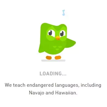
Microinteractions are tiny, delightful details that add fun and engagement to the user experience. In this case, while the page is loading for the next step, the owl's little dance or funny face is a microinteraction. It's a small, animated element that brings joy and lightens the mood. This not only makes the waiting time more enjoyable but also adds a human touch to the learning process.

Duolingo is renowned for its effective and engaging language teaching approach.And one more thing, its owl mascot. It's not just any owl; it's Duolingo's fun mascot! This adorable owl doesn't want you to get bored or distracted, so it does something cute, like maybe a little dance or a funny movement. It's like a mini show while you wait.

This owl mascot in Duolingo isn't just there to look adorable; it's a clever example of a microinteraction.
Confirm Button (Aaron Iker)
We stumbled upon this incredible creation by the talented designer Aaron Iker on Dribbble. The designer infused a playful touch into the confirmation button, turning the mundane act of clicking into a delightful and exhilarating experience. This thoughtful design not only captivated users but also injected a sense of joy and anticipation, enhancing the overall user experience.

Email Validation (Mamun Srizon)
The intuitive design instantly directs users, providing immediate guidance on whether their entered email format is accurate or needs adjustment. This user-friendly feature significantly contributes to a seamless experience, ensuring that end users navigate effortlessly through the process.

As we can see from above examples, Microinteractions are tiny, specific moments in a user's interaction with a product or interface. They might seem small, but they add up to create a more engaging and enjoyable user experience by providing instant feedback and making interactions feel dynamic and responsive.
How to craft seamless user boarding experience using microinteractions ?
We all know the age old saying on how first impression works. In reality, this saying hit even harder in today's digital age where attention spans are shorter, and users have a myriad of options at their fingertips.
The first impression often sets the tone for the overall user experience. A well-designed, intuitive, and visually appealing website or app immediately engages users and encourages them to explore further. On the contrary, a poor first impression may lead to users quickly abandoning the site or app.
Long story short, making a positive first impression contributes to user retention. Users who have a good initial experience are more likely to return and engage with your digital platform repeatedly.

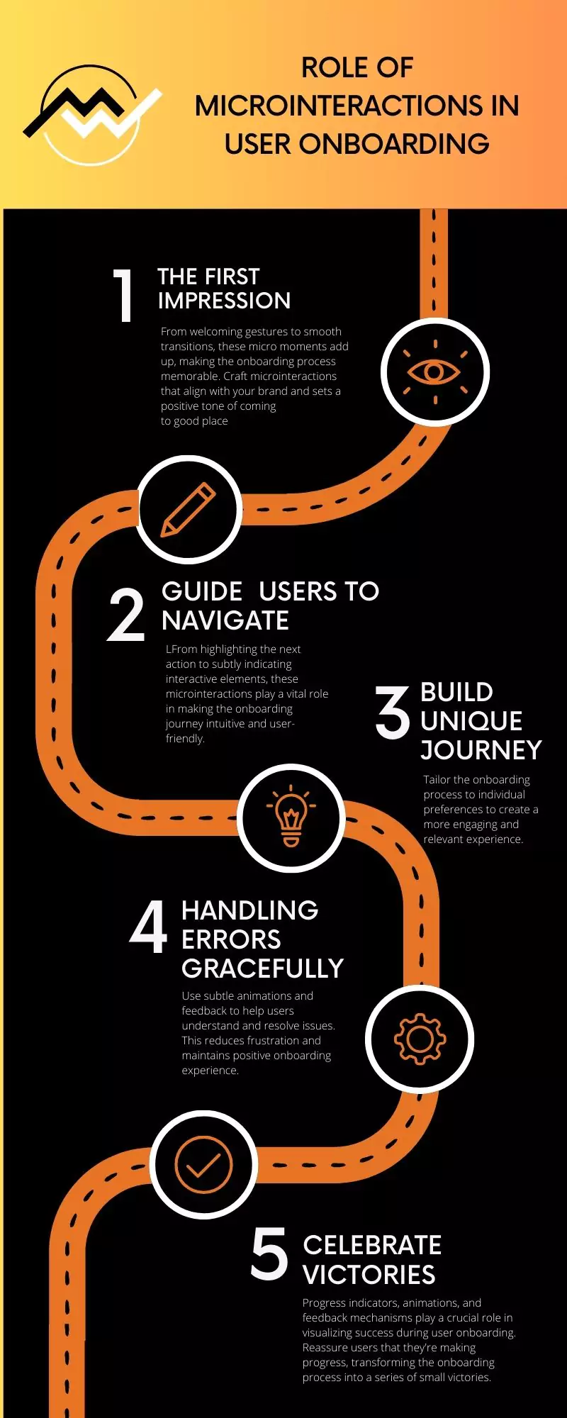
Let us know now go through 5 key points to craft seamless onboarding experience.
User onboarding is more than just a functional process; it's an opportunity to make a lasting impression. Microinteractions, those subtle animations and feedback mechanisms, contribute significantly to creating a positive first experience. From welcoming gestures to smooth transitions, these micro moments add up, making the onboarding process memorable.
Welcome Animations
As the user launches the app, a gentle fade-in animation introduces the brand logo or app name, accompanied by a soft sound effect. This creates a sense of arrival and sets a positive tone.
Interactive Elements
Implement microinteractions that respond to user touch. When a user taps a button or swipes to the next onboarding screen, provide instant visual feedback such as a change in color or a slight bounce effect. This immediate response fosters a sense of responsiveness and interactivity.
Loading Animations
If there's a brief loading period during onboarding (such as fetching user data), incorporate a visually engaging loading animation. This can be a subtle spinner or a creative animation related to your app's theme. The key is to keep the user engaged rather than leaving them staring at a static screen.
Call-to-Action Highlights
During onboarding, when prompting users to take a specific action like filling out a form, use microinteractions to highlight the importance of the action. For instance, a slight pulse animation on the "Next" button subtly draws attention, encouraging users to proceed.
Guide Users Effectively with Microinteractions acting as a silent guide, providing navigational cues and easing users into the app's features. From highlighting the next action to subtly indicating interactive elements, these microinteractions play a vital role in making the onboarding journey intuitive and user-friendly.
User onboarding is akin to a journey, and effective navigation is paramount to guide users through this experience seamlessly.
|
Directional Animations |
When transitioning from one onboarding step to the next, incorporate directional animations. For instance, a subtle arrow pointing towards the next step or a swipe gesture animation can guide users intuitively. |
|
Interactive Tooltips: |
When introducing a new feature or functionality, use interactive tooltips with microinteractions. A pulsating tooltip near a button or a brief animation highlighting a specific area provides users with guidance without overwhelming them with information. |
|
Progress Indicators |
Utilize microinteractions in progress indicators to showcase the user's journey through the onboarding process. A dynamic progress bar that fills gradually or step indicators that highlight the current step help users understand where they are in the overall onboarding flow. |
|
Reactive Icons: |
If users need to interact with specific icons during onboarding, make these icons react to user input. For instance, a subtle color change or a bounce effect when a user taps on an icon communicates that it's an interactive element, encouraging further exploration. |
|
Swipe and Gesture Tutorials: |
If your app involves swipe gestures or unique navigation gestures, introduce these through microinteractions. A brief tutorial with animated hands demonstrating the swipe action educates users on how to navigate within the app. |
The onboarding process is a journey, and users appreciate knowing where they stand and what they've accomplished. Microinteractions come into play to visualize progress effectively, providing users with a sense of achievement and encouraging them to move forward.
|
Progress Indicators |
Use animated checkmarks or ticks to signify completed tasks or steps. When a user successfully finishes a section of the onboarding, a checkmark appears with a gentle animation, creating a sense of accomplishment. |
|
Rewarding Animations |
Celebrate milestones with rewarding animations. For instance, when a user completes the entire onboarding process, a confetti animation or a brief firework display on the screen can create a festive and positive atmosphere. |
|
Dynamic Feedback: |
Provide dynamic feedback during interactions. For example, if users successfully input information or complete a task, a subtle vibration or color change can signal success, making the onboarding process more engaging. |
Visualizing progress with microinteractions serves as a motivational tool. Seeing tangible evidence of achievement encourages users to continue and complete the onboarding process.
Onboarding processes aren't always smooth, and users may encounter errors or face challenges. Microinteractions play a crucial role in gracefully handling errors, providing feedback, and guiding users to resolutions. Here's a closer look at how microinteractions can be utilized to reduce friction during onboarding:
|
Error Notifications |
When a user inputs incorrect information, use microinteractions to display an error notification. This could be a brief shake animation on the incorrect field or a color change accompanied by an explanatory tooltip, clearly indicating the issue. |
|
Contextual Guidance |
Instead of a generic error message, use microinteractions to highlight the specific area that needs attention, guiding users on how to correct the mistake. |
|
Animated Corrections: |
For instance, if a user enters an invalid password and then corrects it, a smooth transition or a checkmark animation can visually signal that the issue has been resolved. |
|
Preventing Submissions |
Anticipate errors before submission and use microinteractions to prevent users from progressing. For example, disable the "Next" button until all required fields are correctly filled, accompanied by a microinteraction that hints at the missing information. |
Personalization in onboarding goes beyond generic experiences, acknowledging the uniqueness of each user. Microinteractions play a crucial role in tailoring the onboarding process to individual preferences, creating a more engaging and relevant experience. Let’s see few examples on how microinteractions can be used for personalized onboarding:
|
User-Centric Greetings |
Instead of a generic welcome message, personalize the greeting based on user data. If the user signs up with their name, use microinteractions to dynamically display a personalized welcome, such as "Hello, [User's Name]!" |
|
Dynamic Content Highlights |
Tailor onboarding content based on user preferences. If your app offers various features, use microinteractions to highlight those that align with the user's expressed interests or previous interactions within the app. |
|
Personalized Tutorials: |
If your app provides tutorials, personalize them based on the user's skill level or interests. Use microinteractions to dynamically adjust the tutorial content, ensuring it aligns with what the user needs or wants to learn. |
Microinteractions are used to personalize the content recommendations during onboarding, showcasing movie or series genres that align with the user's unique taste.
In conclusion, visualizing onboarding progress with microinteractions is a key element in creating a positive and engaging user experience. By incorporating dynamic feedback, rewards, and progress indicators, you guide users through their journey, reduce uncertainty, and motivate them to successfully complete the onboarding process.

